Fleur de Lis Energy came to EnerCom with a logo that had fallen out of date. Although it was composed of a strong image and icon that had positive brand associations for their company, it was aging the company negatively. The new logo included key component of the previous logo—a Fleur de Lis—but with a unique flare. EnerCom developed an entirely new color palette and font usage for the brand. In addition to the redesign work, EnerCom created Brand Standards for Fleur de Lis which included guidelines for consistent branding across the company.
EnerCom also designed a full suite of branded stationery for the client—business cards, letterhead, notepads, etc. The corporate presentation was built by our consultants with guidance from the Fleur de Lis executive team and aligned with the new brand guidelines. When redesigning the website, EnerCom’s design and consulting teams were tasked with copywriting, sourcing images, and designing custom infographic icons—all of which communicated the Fleur de Lis message envisioned by the client’s leadership team.
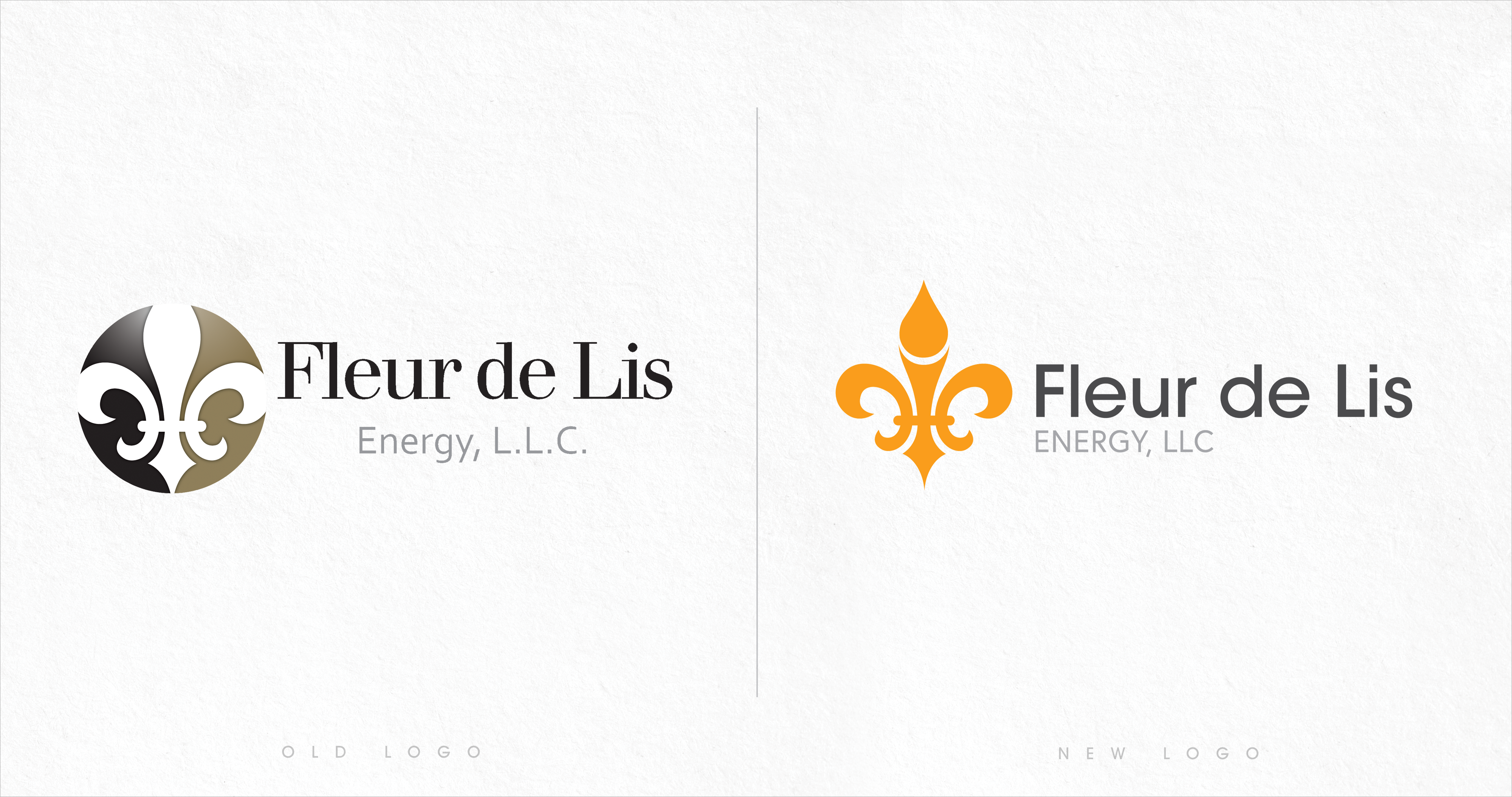 Identity Development
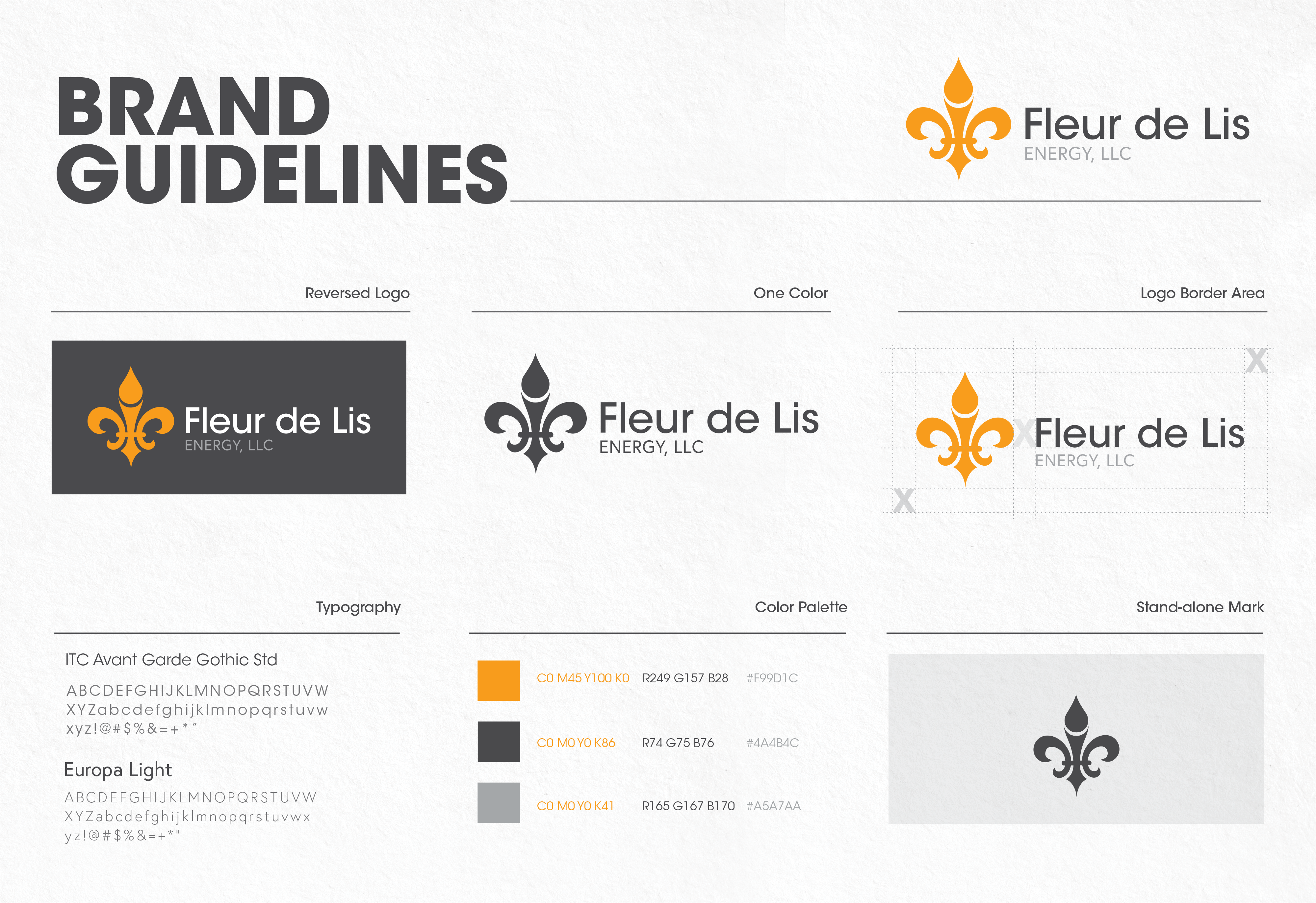 Brand Guidelines
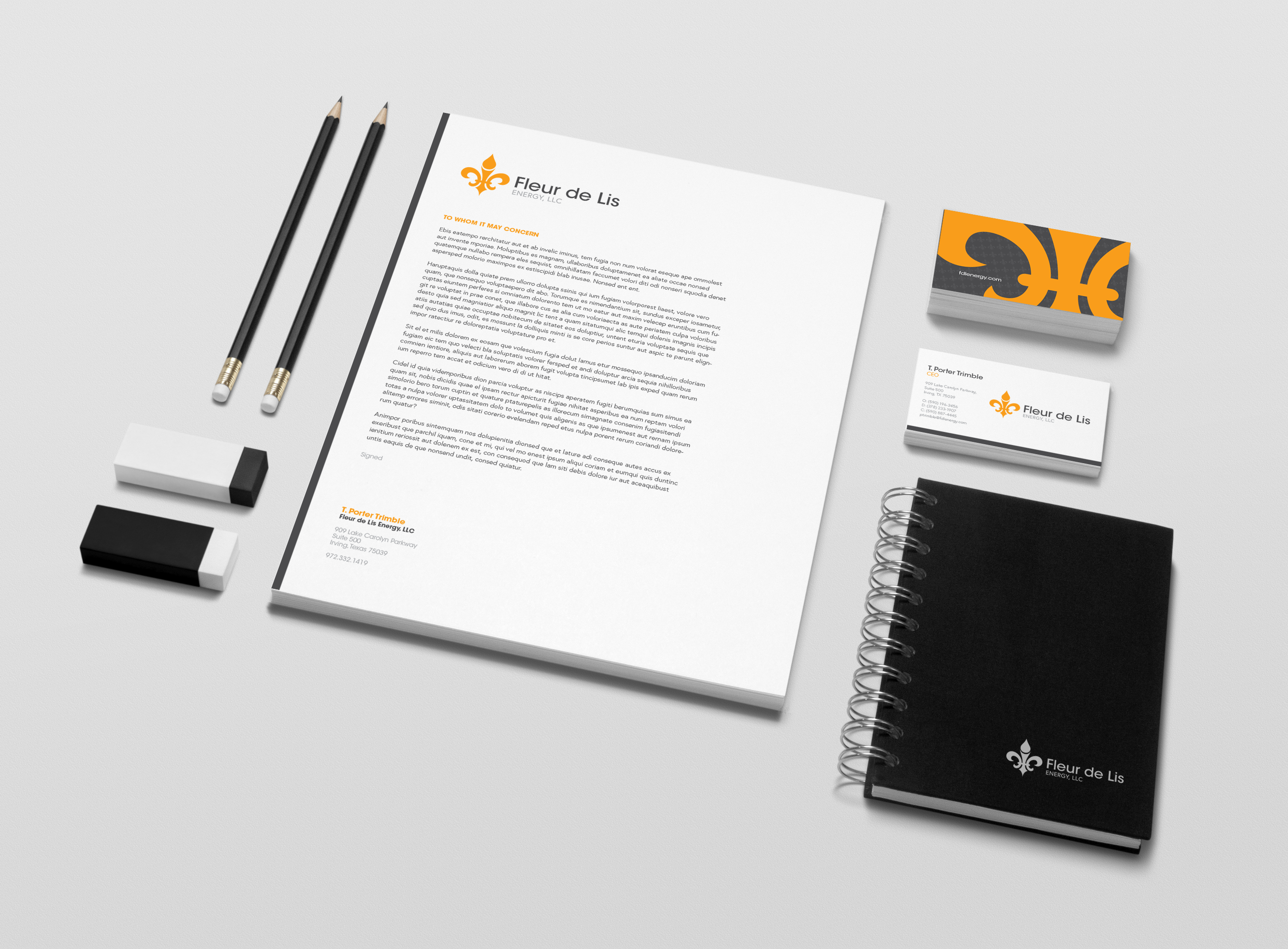
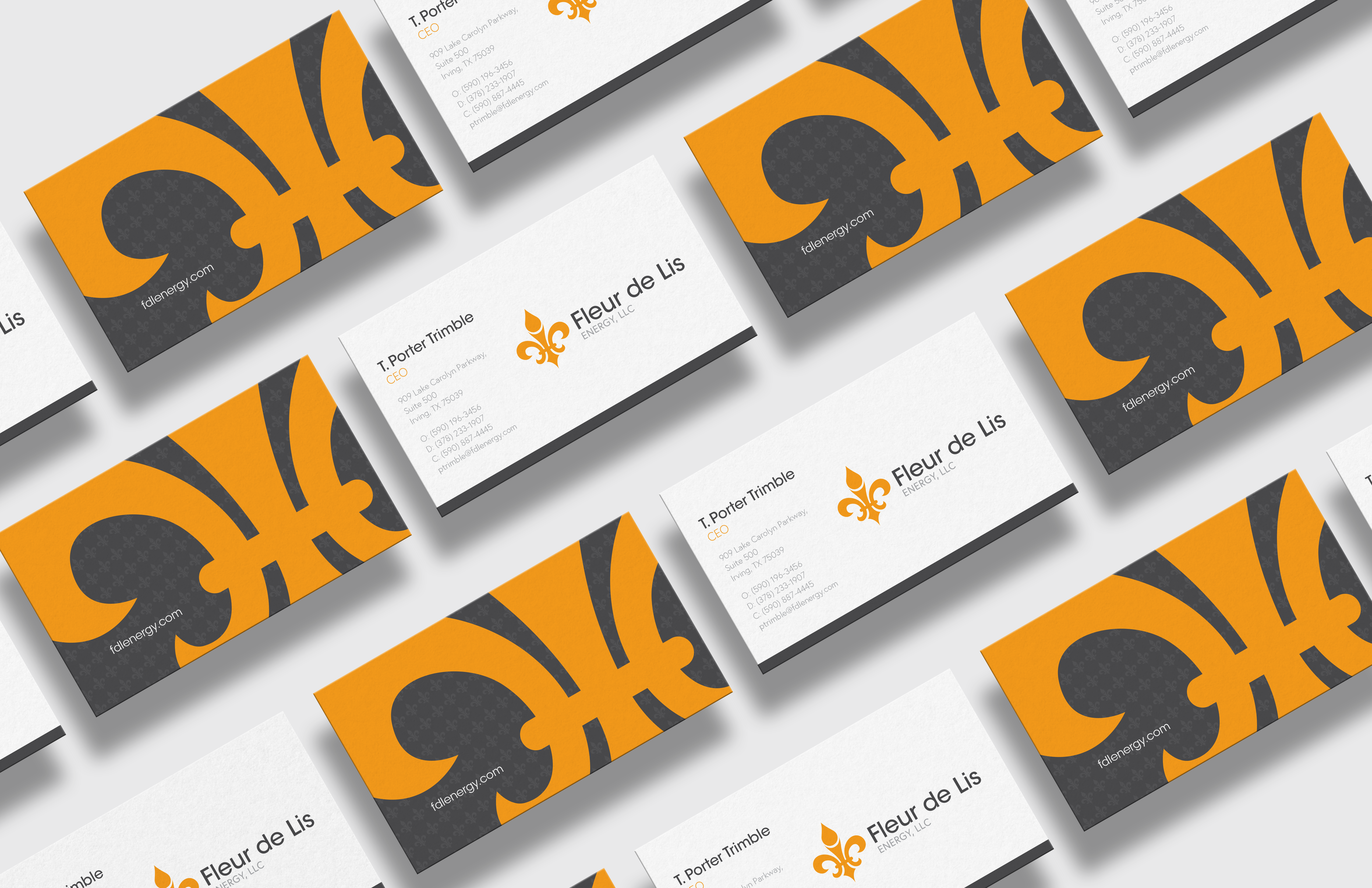 Stationery Package
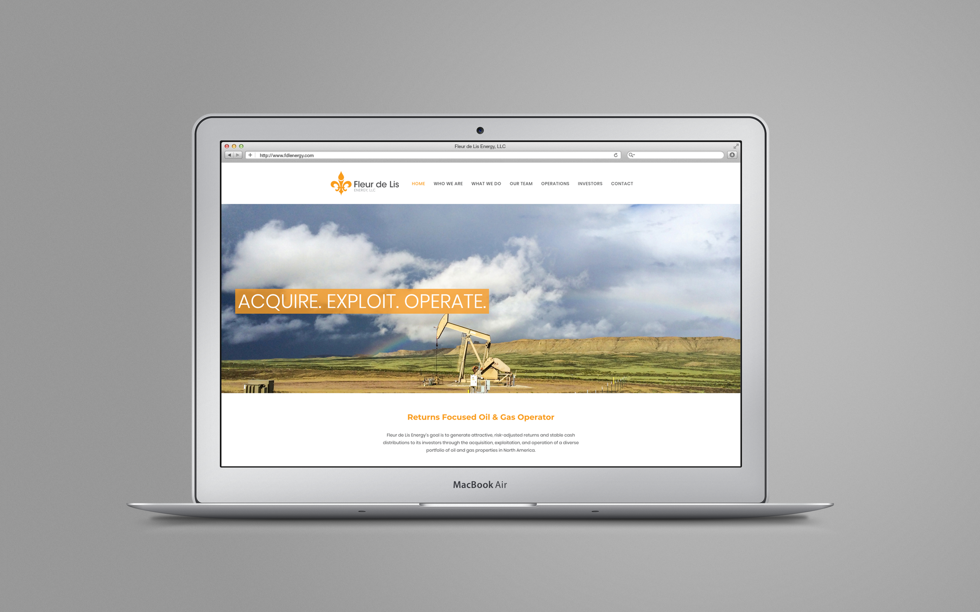
 Web Design & Development
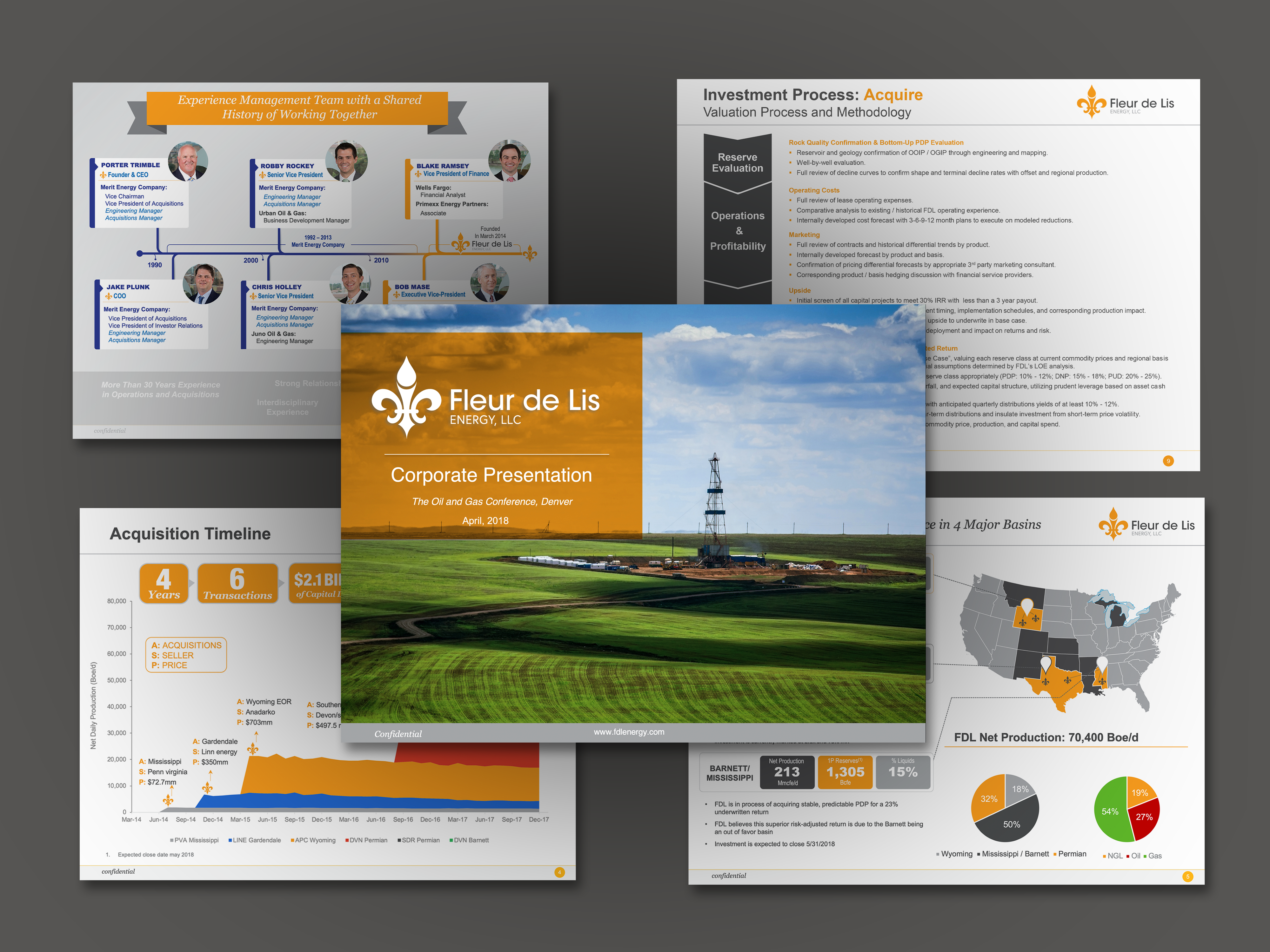 Corporate Presentation
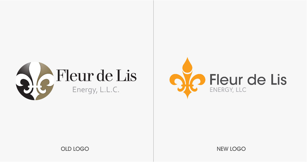 Identity Development
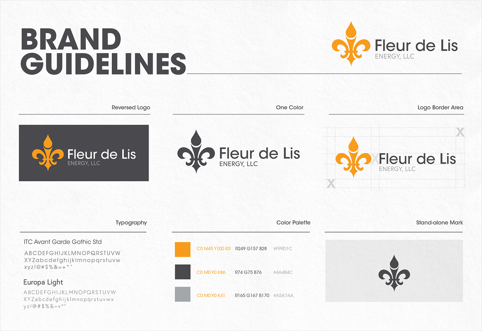 Brand Guidelines
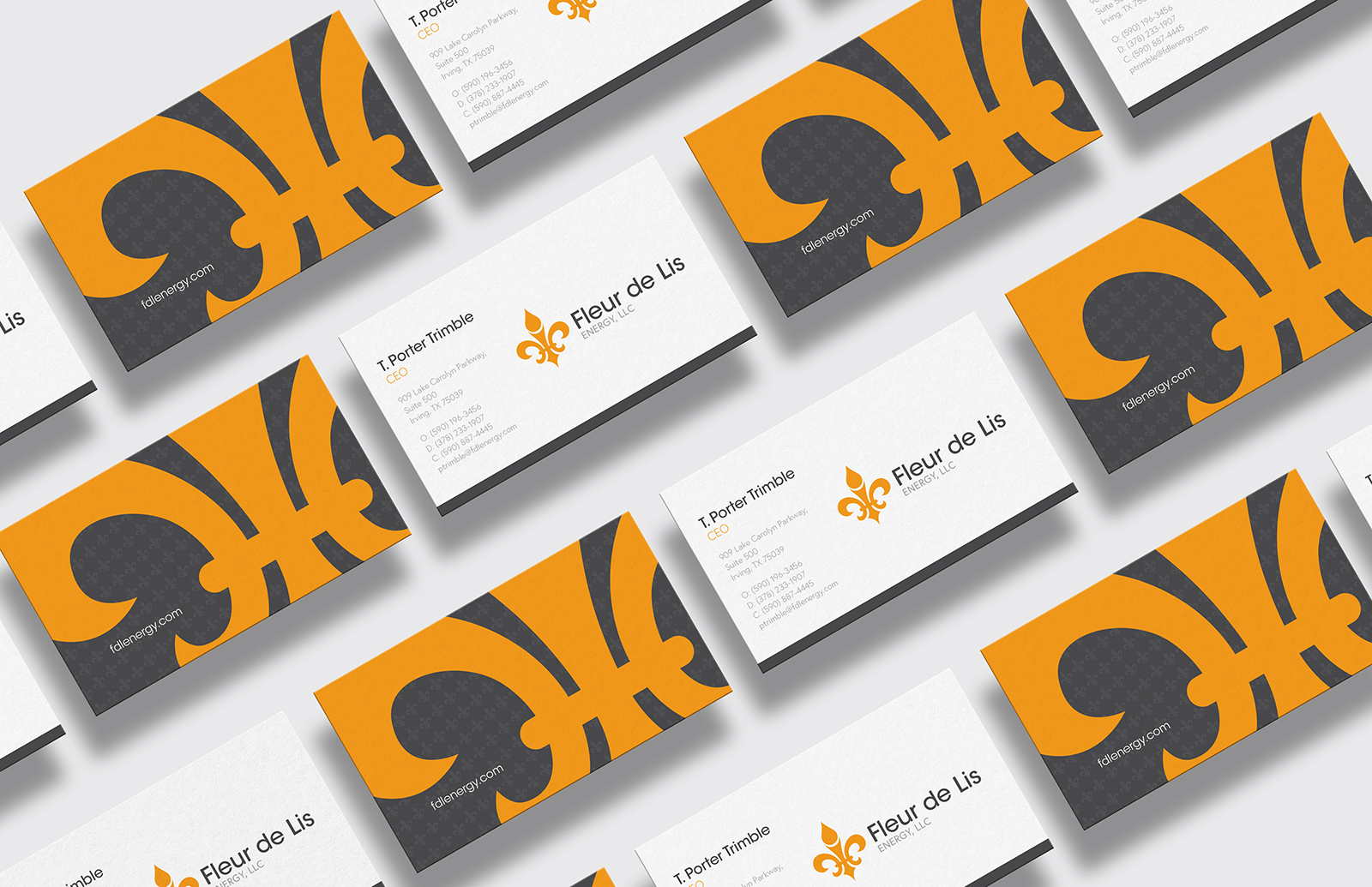 Stationery Package
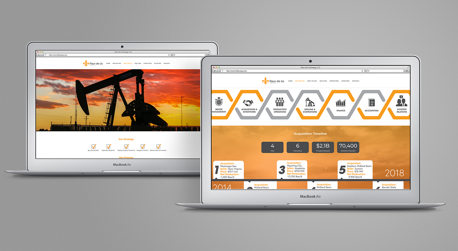 Web Design & Development
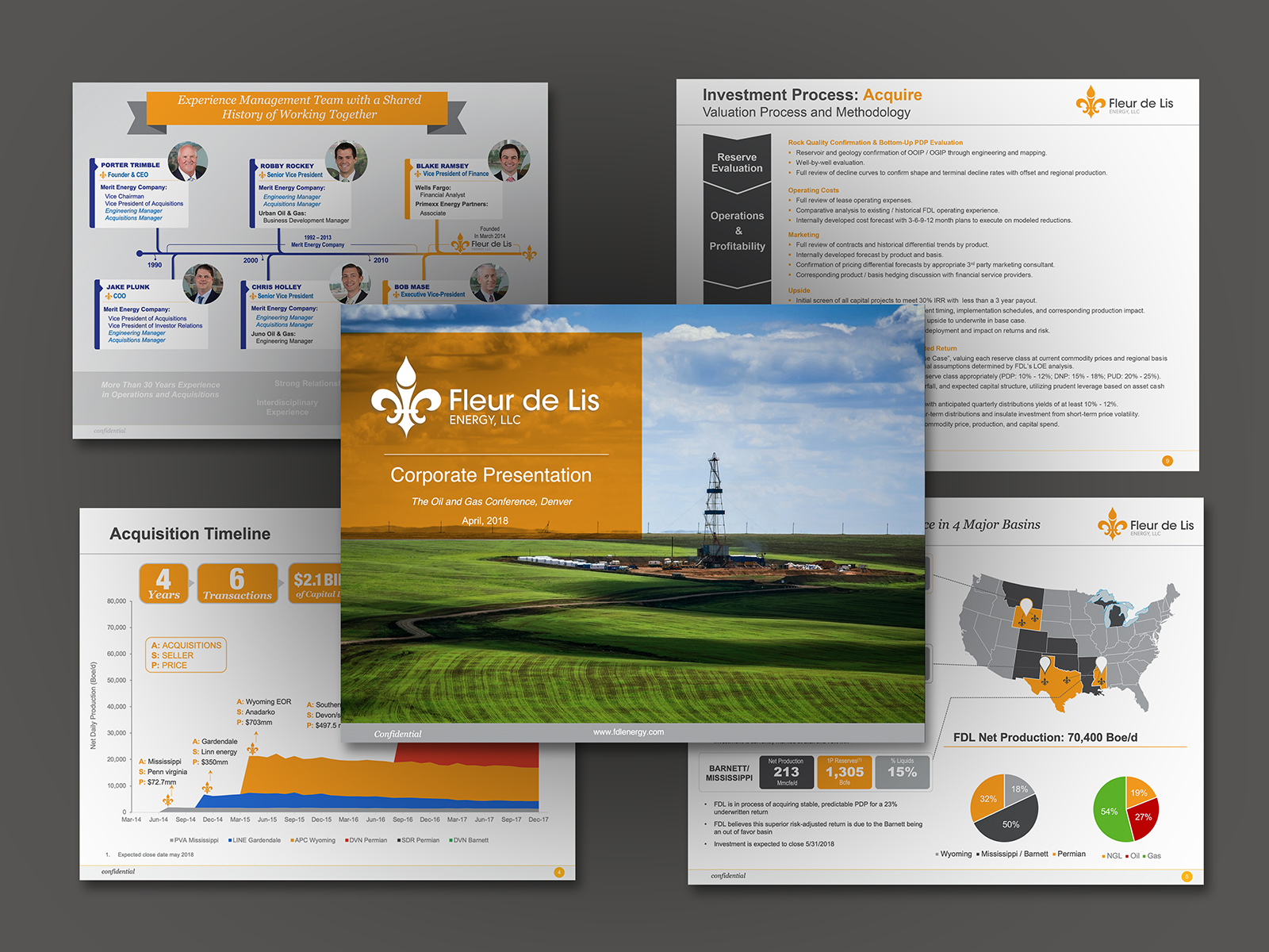 Corporate Presentation
ENERCOM IS CERTIFIED MINORITY & WOMEN OWNED BUSINESS ENTERPRISE.
follow us
